Coraline endures as tattoo source material for a practical reason most roundups never articulate: the film’s visual language was designed to read at a glance. Strong silhouettes, a limited color palette, and props that work as standalone symbols (buttons, the key, the door, the cat) mean the imagery translates to skin better than most fandom art. A button eye is recognizable at an inch wide. That’s rare.
But fandom tattoos have a specific failure mode: they get copied from film stills at the wrong scale, in the wrong style, by the wrong artist, and they age badly. Fourteen ideas below, each with the technique and placement thinking that determines whether it holds up, then the guidance on aging, artist selection, and originality that separates a lasting piece from a fading screenshot.
1. Classic Button-Eye Coraline Portrait Tattoo
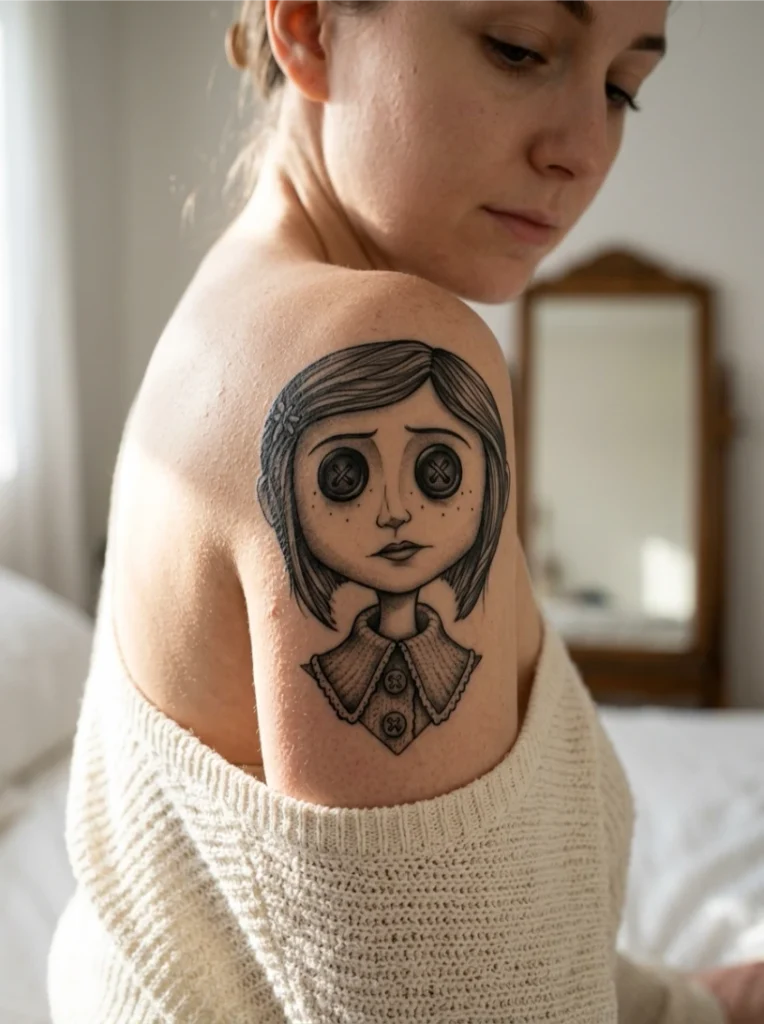
The entry point: an illustrative portrait where the button eyes are the clear focal point. The technique lives or dies on controlled line weight around the eye sockets; that’s what makes the gaze read as intentionally unsettling rather than accidentally sloppy.
Stitching detail is the make-or-break element. Bring high-resolution reference so the artist matches the button stitching pattern, not just the eye shape, and ask for slightly asymmetrical button placement. Perfect symmetry reads as a sticker; slight asymmetry reads as hand-stitched.
2. Coraline Tattoo Sleeve With The Other Mother’s Garden
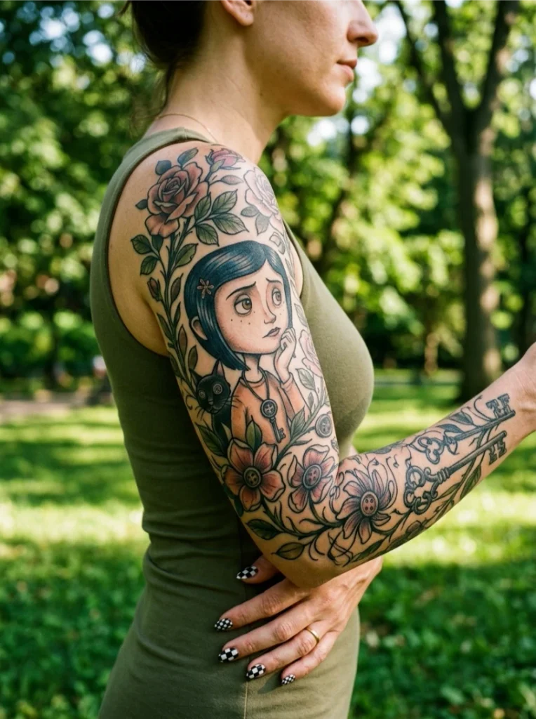
A full sleeve lets the artist tell the story instead of freezing one image: the central figure anchored while a stylized garden winds around the arm, part real flowers, part the Other Mother’s twisted version underneath. Neo-traditional botanical work handles this best, with bold outlines separating the two garden halves so the transition from ordinary to wrong feels deliberate.
Treat a sleeve as an evolving piece built session by session, not a single appointment. Map the full composition with your artist before the first session; garden elements added piecemeal later look bolted on. And leave negative space between the garden and the figure. The eye needs somewhere to rest.
Plan the flow first
Sleeves fail more often from bad composition than bad technique. Sketch the shoulder-to-wrist flow on paper before any needle work. If the plan doesn’t read as one piece on paper, it won’t on skin.
3. Neo-Traditional Coraline Tattoo In Her Yellow Raincoat
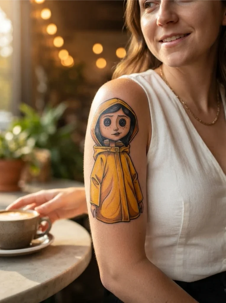
The yellow raincoat is the single most recognizable costume element, and neo-traditional technique, bold black containment lines with flat saturated fills, makes it pop from across a room in a way black-and-grey portraiture doesn’t.
Two honest notes. First, flat yellow can read as cartoonish without subtle tonal shifts in the folds, so ask for orange shading in the coat’s creases to suggest fabric weight. Second, yellow fades faster than darker pigments. This is not the lowest-maintenance color choice on this list; budget for earlier touch-ups if you choose it.
4. Coraline And The Black Cat Companion Tattoo
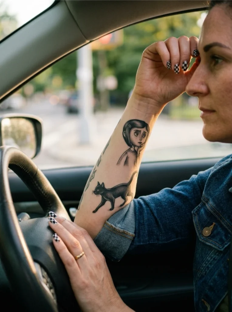
The unnamed black cat, the story’s only honest guide, paired with Coraline herself. Two-subject compositions are trickier than they look: stagger the figures diagonally rather than side by side to create motion and narrative instead of a static double portrait.
Decide the cat’s pose before the consultation. Mid-motion or seated changes the whole composition’s energy, and a slightly arched back or flicked tail adds movement a static portrait can’t. Don’t shrink the cat to fit; an undersized companion reads as an afterthought.
See Also: Rocky Horror Tattoo: 18 Iconic Ideas Worth Booking
5. Coraline Vine Tattoo Wrapping The Forearm
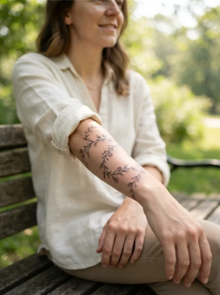
Fine-line botanical work: thin vines wrapping the forearm with tiny button motifs tucked between the leaves. This reads as delicate first and film-inspired second, which suits anyone who wants the reference without announcing it.
Fine linework depends entirely on consistent needle depth, and skin type affects how thin lines age more than with bolder styles. Skin that scars easily won’t hold fine lines crisply long-term. Space the button motifs unevenly along the vine; even spacing reads as a border pattern rather than a design.
6. Coraline Mouse Tattoo Circus Tribute
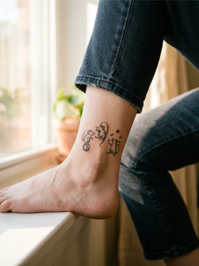
The jumping mice, one of the film’s strangest set pieces and one of the least-used tattoo subjects. Small illustrative figures at compressed scale need dotwork-style shading and simplified single-needle detailing rather than full rendering.
Resist the full lineup. A single mouse mid-jump reads clearer at small sizes than a crowded circus, and cramming too many figures into a small space turns the design muddy. Confirm your artist can keep tiny features clean at your chosen size; some studios only execute this well above a certain scale.
7. Coraline Holding Her Vintage Camera Tattoo
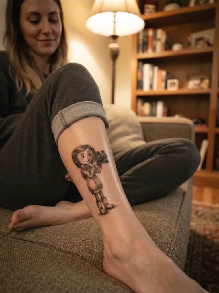
The camera scene’s melancholic tone, captured through technique: soft black-and-grey shading over confident linework for a sketch-like, vintage-photo quality. This is one of the most technically demanding options here, depending almost entirely on gradual shading transitions.
Vet the artist on shaded portrait work specifically, not just their general black-and-grey. A heavy-handed approach flattens the vintage quality permanently, and touch-ups rarely restore that softness. Ask for slightly warmer grey tones instead of pure black; it nods to the camera theme without adding color.
8. Coraline With Headphones And Garden Shears Tattoo
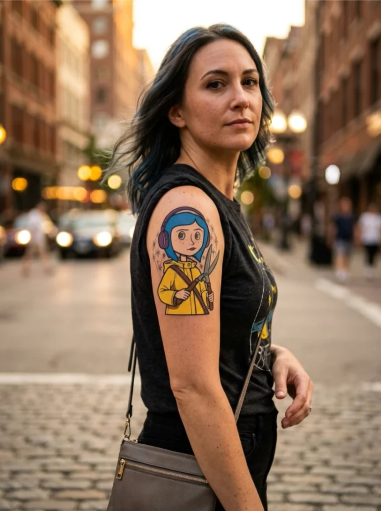
A playful remix rather than a film-still replica: canon imagery with creative license. Bold, pop-art-adjacent color suits this approach, with flat saturated fills reading as intentional stylization.
The skill here is restraint. One meaningful prop personalizes the piece; two is the ceiling before it becomes visual clutter. Choose whichever addition matters most to you personally and let the composition stay simple around it. A star-flecked background keeps added elements from looking randomly placed.
9. Button-Eye Doll Close-Up Tattoo
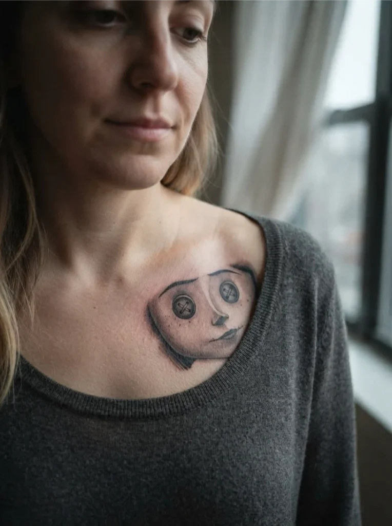
Cropped tight on just the eyes and stitched mouth: pure atmosphere, no coat or hairstyle for context. Realistic black-and-grey with heavy stitching texture carries this design, and it’s the horror-leaning end of the spectrum rather than the whimsical end.
Be honest with yourself about which tone you want before committing. This piece won’t read as cute, and someone glancing at it may not clock the source material at all. Keep the crop tight; eyes and mouth alone read more unsettling than the full face, which is the entire point.
Tone check
Before booking any Coraline piece, decide where you sit on the eerie-to-warm spectrum. Horror-leaning designs (close-ups, ghost children) and warm designs (raincoat, watercolor) age into very different tattoos. Committing to one tone beats splitting the difference.
10. Coraline Sleeve With The Key And Door Motif
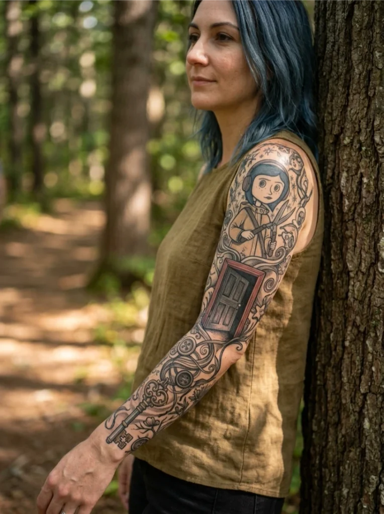
The small door and its key, choice and consequence, threaded through a full sleeve alongside the central figure. Illustrative black-and-grey with selective color on the door or key moves the eye through the composition in a deliberate order.
Don’t make the key the smallest element; small keys blur at a distance and the symbolism gets lost. A slightly ajar door, rather than fully open or shut, keeps the story feeling unresolved, which fits the ending. Like the garden sleeve, this needs its layout sketched before the first session, not figured out session by session.
11. Watercolor Coraline Tattoo With Starry Backdrop
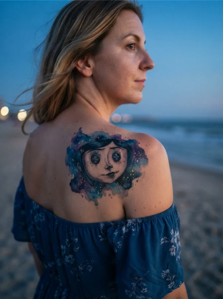
Watercolor technique against a soft night sky shifts the read from eerie to dreamy. The wash comes from layered diluted pigment around a solid black linework anchor, which keeps the portrait from dissolving into color.
This is the least predictable ager on the list. Watercolor softens visibly in its first year, more than solid color or black-and-grey. That’s a trade-off to understand, not a flaw, but it means planning earlier touch-ups and choosing only an artist with a strong watercolor portfolio specifically. Keep the linework portrait bold; watercolor alone softens into an unrecognizable blur over time.
See Also: 16 Clever Tattoo Ideas With Secret Meaning for Women
12. Minimalist Fine-Line Coraline Tattoo
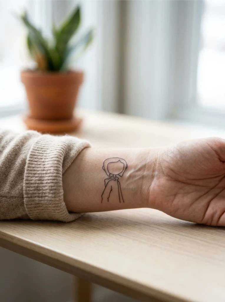
The lowest-commitment option: a single-line silhouette or heavily simplified portrait. One consistent needle weight throughout means every line has to be intentional from the first pass; there’s nowhere to hide inconsistency.
This suits first-timers and anyone building a small fandom collection rather than one statement piece. A single-line silhouette of just the hair and coat shape, no facial detail, reads as recognizable without color or shading. For more on what survives at tiny sizes, our small tattoo ideas guide covers the legibility rules that apply here. Just know that fine line at very small sizes blurs within a few years; simplicity doesn’t exempt it from aging.
13. Blackwork Coraline Silhouette Tattoo
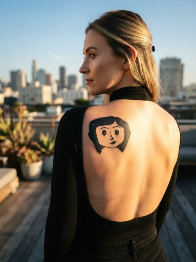
The opposite of minimalism: a solid black silhouette with negative space carved out for the button eyes. Blackwork depends entirely on even saturation; gaps show far more in solid black than in shaded work.
This is the most permanent choice on the list in a practical sense. Solid black is genuinely difficult to cover or modify later, so treat the decision with more weight than a shaded portrait. Confirm your artist’s experience with solid saturation specifically, and don’t skip the negative-space button eyes. Against the solid black, that detail is what makes the piece instantly readable, a trick straight out of the silhouette tradition.
14. Coraline And The Ghost Children Tattoo
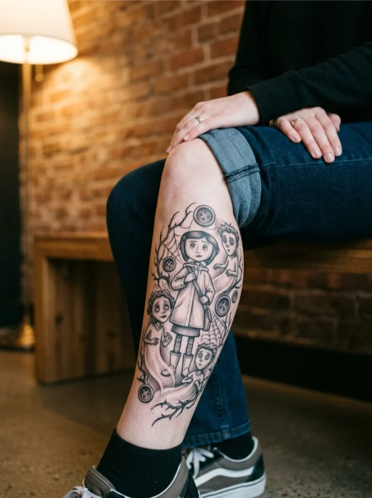
The narratively densest concept: the ghost children trapped in the walls, rendered translucent through selective shading rather than solid linework. Translucency relies on suggestion, which makes this genuinely difficult to execute.
Composition planning matters more here than anywhere else on the list. Vary the ghosts’ poses, sizes, and shading depths; uniform figures read as background pattern rather than individual characters. Ask your artist to sketch the composition first. Translucent effects are hard to picture from description alone, and at six inches or more each figure stays distinguishable.
How Each Style Ages: The Honest Version
Nobody compares these styles on longevity, so here it is. Bold neo-traditional and blackwork age the most predictably; strong lines and solid fills hold for years with minimal softening. Illustrative black-and-grey softens gracefully but loses fine stitching detail first, so button work needs bolder lines than the reference suggests. Fine-line minimalism blurs fastest, especially under two inches; plan for it as a shorter-lived piece or go slightly larger. Watercolor fades and softens most visibly in year one; it needs the boldest underlying linework and the earliest touch-up planning. Color pieces (raincoat yellow especially) need sun protection and scheduled touch-ups; yellow is among the fastest-fading pigments.
The universal rule: ask to see healed photos of the specific style, not just fresh work. Fresh watercolor and fresh fine-line always look perfect. Healed tells the truth.
Placement Matched to Design
Placements get listed everywhere but never matched to designs. Here’s the matching logic. Portraits need flat, stable skin with room: upper arm, shoulder blade, outer thigh. Curved or high-movement areas distort faces. Sleeve narratives need the full arm’s length; compressing a story sleeve onto a forearm crowds it. Fine-line vines want the forearm’s long line but avoid the inner wrist’s constant flexing. Small motifs (mice, minimalist) suit ankles, wrists, behind the ear, but remember the aging trade-off at tiny sizes. Horror-leaning close-ups suit concealable placements (ribs, upper chest, back of neck) if you want control over when the tone shows. Color pieces do best where sun exposure is manageable; shoulders and calves beat forearms for fading.
Match the design’s needs to the body’s geometry, not just to where you want to look at it.
Briefing Your Artist: Don’t Bring a Screenshot
Here’s the etiquette nobody writes down. Bringing a film still and asking for an exact copy is the weakest brief; it also puts the artist in an awkward spot on originality. Better: bring three to five references showing the vibe you want (“spooky-cute, not full horror”), point to what you like in each, and let the artist design the composition. Describe the feeling, not the frame.
Vet for this specific work. Look for dark-fantasy or illustrative portfolios, not just general color or realism. Ask: have you done stop-motion or animation-inspired pieces before? Can I see healed photos of fine-line or watercolor work? How would you adapt this reference so it ages well? An artist who pushes back on your reference with aging concerns is a good sign, not a difficult one. For the design-transfer mechanics, our tattoo stencil ideas guide explains why the stencil stage matters more than people think.
And the temporary test: wear a high-quality temporary version for two weeks first, especially for horror-leaning designs. You’ll learn more about living with the tone than from any amount of scrolling.
Make It Yours: A Personalization Framework
Instead of another symbol dictionary, here’s how to personalize as a decision process. First, choose your tone (eerie, warm, or balanced) and let it rule out half the list immediately. Second, choose your scale commitment (single small piece, statement piece, or sleeve-in-progress); this determines which ideas are even viable. Third, pick the story beat that actually moved you, not the most popular image; the ghost children mean more if that scene stayed with you than the button eyes do as a default. Fourth, add one personal element: a date in the key’s teeth, your own cat’s silhouette alongside the black cat, a quote in your own handwriting. One personal addition transforms a fandom tattoo into your tattoo.
A Coraline tattoo works best when it’s a starting point, not a replica. The film gives you the visual language; your story should supply the sentence.
Quick Comparison
| Design | Best Placement | Longevity | Tone |
|---|---|---|---|
| Button-Eye Portrait | Upper arm, shoulder | Good with bold lines | Eerie |
| Garden Sleeve | Full arm | Good, multi-session | Balanced |
| Yellow Raincoat | Upper arm, calf | Needs touch-ups | Warm |
| Cat Companion | Forearm, thigh | Good | Warm |
| Vine Wrap | Forearm | Fades thinner | Subtle |
| Mouse Circus | Ankle, wrist | Good at right size | Playful |
| Vintage Camera | Inner forearm, calf | Good | Melancholic |
| Headphones Remix | Upper arm, shoulder | Good | Playful |
| Button-Eye Close-Up | Chest, ribs, neck | Good | Horror |
| Key and Door Sleeve | Full arm | Good, multi-session | Balanced |
| Watercolor Starry | Shoulder, back, calf | Softens year one | Dreamy |
| Minimalist Fine-Line | Wrist, ankle | Blurs fastest | Subtle |
| Blackwork Silhouette | Shoulder blade, calf | Most permanent | Bold |
| Ghost Children | Back, thigh | Good at large scale | Eerie |
Frequently Asked Questions
Are Coraline tattoos horror tattoos or cute tattoos?
It depends entirely on the version. Button-eye close-ups and ghost children lean horror; raincoat and watercolor versions lean whimsical and warm. Decide your tone before choosing the design, not after.
What’s the most beginner-friendly idea on this list?
The minimalist fine-line silhouette: small, quick, low commitment. Just understand that fine line at tiny sizes blurs within a few years, so treat it as a shorter-lived piece or go slightly larger than your instinct.
Do sleeve versions need to be finished in one session?
No. Sleeves are almost always built across multiple sessions over weeks or months. The critical step is mapping the full composition before the first session, not finishing it in one.
Is the button-eye detail necessary for a design to stay recognizable?
Not strictly, but it’s the single most recognizable identifier. Designs that skip it rely on coat shape and hair silhouette to stay legible, which works but narrows your margin for error.
Can I just bring a screenshot of the film to my artist?
You can, but a screenshot is the weakest brief. Bring several references showing the vibe you want, describe the feeling, and let the artist design an original composition. It’ll age better and be unmistakably yours.
A Final Thought
Fourteen ideas in, the throughline is commitment: to one tone, to the right scale, to an artist who understands the aesthetic, and to making it yours rather than copying a frame. The designs that last are the ones designed for skin, not for screens. Pick the story beat that moved you, size it for aging, brief your artist on feeling rather than frames, and let the button eyes do what they’ve always done: unsettle just enough to be unforgettable.